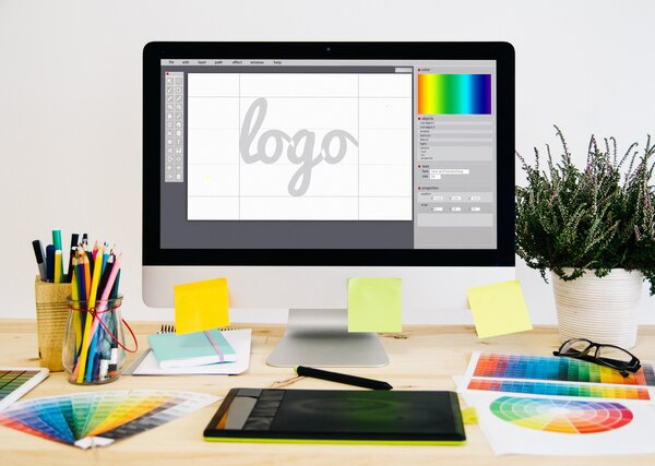
Designing Consistent Visual Identities for Growing Businesses
Designing a consistent visual identity is one of the most powerful ways a growing business can build recognition, trust, and perceived value. As you scale—new products, new channels, new markets—your brand will be interpreted and reproduced by more people: designers, marketers, partners, even customers. Consistency is what keeps it all feeling like one coherent brand instead of a patchwork.
Below is a structured way to think about creating and maintaining a strong, consistent visual identity as your business grows.
1. Start with Strategy, Not Aesthetics
A visual identity should express who you are, not just what looks fashionable.
Before you choose colors or typefaces, define:
- Brand purpose – Why do you exist beyond making money?
- Positioning – How are you different from competitors, and in what “space” do you want to live in customers’ minds?
- Target audiences – Who are you talking to? What do they value, fear, aspire to?
- Personality and tone – If your brand were a person, how would it behave: bold, calm, playful, authoritative?
Translate this into a short brand platform (often 1–2 pages):
core promise, values, personality traits, and 3–5 key messages. This becomes the North Star for every visual decision.
2. Define the Core Visual Building Blocks
Your identity system should be flexible enough to grow, but strict enough to stay recognizable. Focus on the core elements that must remain consistent.
Logo System
- Primary logo: The main lockup (symbol + wordmark or just logotype).
- Secondary versions: Horizontal, vertical, icon-only, and text-only versions for different spaces.
- Clear-space rules: Minimum padding around the logo so it can “breathe.”
- Minimum sizes: To ensure legibility on mobile, print, and small UI components.
- Incorrect usage: Explicit examples of what not to do (no stretching, recoloring, drop shadows, busy backgrounds).
A growing business benefits from a modular logo system—a recognizable symbol that can work across products, social avatars, and app icons while still tying back to the main brand.
Color Palette
Build a palette that can scale with your needs:
- Core brand colors (1–3): Used for logo, primary buttons, and key brand moments. These create instant recognition.
- Secondary palette (3–6 colors): For backgrounds, charts, illustrations, and supporting graphics.
- Accent colors (1–2): For alerts, promotions, or special highlights.
For each color, define:
- HEX, RGB, CMYK, and Pantone (if you print).
- Usage rules: which colors are for large surfaces, which are for text, which are reserved for specific functions (e.g., error states, CTAs).
Keep accessibility in mind: ensure sufficient contrast for text and UI components.
Typography
Typography carries a lot of brand personality and heavily influences perceived quality.
- Primary typeface: Used for headings and key statements. It can be more expressive.
- Secondary typeface: For body text, long reads, and UI. It should be highly legible at small sizes.
- Hierarchy rules: Define heading levels (H1–H6), body text, captions, and overlines with sizes, weights, and line spacing.
- Web and product readiness: Choose typefaces available on key platforms or with reliable webfont support to avoid rendering issues.
Document examples of typical layouts—landing page, social post, email—to show how typography should behave in real use.
Imagery and Illustration Style
Photography, illustration, and iconography are where inconsistency usually creeps in as you grow.
- Photography: Define preferred lighting (natural vs. dramatic), framing (close-up vs. wide), color grading (warm vs. cool tones), and subjects (people, product, environment).
- Illustrations: Specify the style—flat, skeuomorphic, line-based, geometric—and typical color usage, complexity limits, and line thickness.
- Icons: Set rules for stroke width, corner radius, filled vs. outline style, and perspective (front, isometric, etc.).
Provide a small library of approved images and icons as a starting point to reduce ad-hoc choices.
3. Design for Flexibility Across Channels
Growing businesses rarely live in one place. Your identity has to adapt to:
- Websites and web apps
- Mobile apps
- Social media platforms
- Presentations and proposals
- Packaging (if relevant)
- Offline materials (events, print, signage)
- Digital advertising
To keep consistency while staying practical:
- Identify your priority touchpoints (e.g., website, LinkedIn, decks) and design master templates for each.
- Create channel-specific adaptations—for example:
- Social: rules for profile pictures, cover images, post layouts, and story formats.
- Product UI: a design system (components, states, grids) that inherits from brand colors, typography, and spacing.
- Presentations: branded templates with pre-defined slide types and content styles.
Think of your visual identity as a design system, not just a logo and colors. It should be systematic, reusable, and component-based.
4. Create Clear, Actionable Brand Guidelines
Guidelines are the bridge between intention and day-to-day execution.
Strong guidelines are:
- Visual, not just textual: Show many examples of correct and incorrect usage.
- Task-oriented: Sections like “How to make a social post,” “How to brand a partner event,” “How to adapt the logo on dark backgrounds.”
- Modular: Separate sections for logo, color, typography, imagery, motion, components, and usage across channels.
For a growing business, it’s wise to maintain:
- Short brand overview (3–5 pages) – for leadership, sales, and partners: essence, personality, key visuals.
- Full brand manual (20–40+ pages) – for designers and agencies: complete specs, examples, and rules.
- Digital asset library – organized folders or a brand portal with logos, fonts, templates, and examples.
Guidelines should be living documents. Expect to update them as your business introduces new products or expands to new regions.
5. Build a Scalable Asset and Template Library
As your team grows, more people will create branded content. They often are not designers.
To keep quality high:
- Create templates for:
- Presentation decks
- One-pagers and case studies
- Social media posts and ads
- Email headers and signatures
- Proposal and document covers
- Use tools your team already works in (Figma, Canva, Google Slides, PowerPoint, Notion) so templates actually get used.
- Set locked elements in templates (logo position, colors, font styles) while allowing flexibility for content.
Maintain a single source of truth—a central place where every updated asset lives, with version control and simple access rules.
6. Establish Governance and Ownership
Consistency is not only a design problem; it’s an organizational one.
For growing businesses, define:
- Brand owner: A person or small team responsible for:
- Approving major brand changes
- Maintaining guidelines and assets
- Onboarding new team members to the brand
- Approval workflow: For major campaigns, website redesigns, or materials that will be widely seen.
- Partner rules: Clear guidance on co-branding and logo lockups with other companies.
Where possible, create checklists for brand reviews:
- Is the logo used correctly?
- Are brand colors and typography applied properly?
- Does imagery align with our style and values?
- Is the tone aligned with our brand personality?
This reduces subjective debates and speeds up approvals.
7. Balance Consistency with Evolution
As companies grow, they change: new markets, products, and customer expectations. A rigid identity can become a constraint.
Design your system so it can evolve without breaking recognition:
- Use a core vs. flexible model:
- Core: logo, primary colors, basic typography, key imagery rules.
- Flexible: secondary palette, illustration styles for specific products, campaign-specific visuals.
- Allow sub-brands or product lines to have distinct flavors:
- Shared elements: core logo, some colors, base typography.
- Distinct elements: unique accent colors, custom illustration motifs, or distinct photography treatments.
When updating visuals—like refreshing colors or typography—do it incrementally. Maintain at least one strong, recognizable element through transitions so audiences don’t lose track of who you are.
8. Consider Cultural and Market Adaptation
Growing businesses often expand to new regions or segments. Visuals can be interpreted differently across cultures.
When designing or adapting your identity:
- Test for color and symbol meanings in local markets.
- Be careful with imagery diversity—people should see themselves in your brand.
- Consider language expansion in typography: does your typeface support Cyrillic, Arabic, or Asian scripts if needed?
- Keep the core structure (logo placement, primary colors, overall composition) consistent, while allowing local teams to adapt content, imagery, and sometimes secondary colors.
This approach preserves brand unity while respecting local relevance.
9. Measure and Refine
Visual identity is not just an aesthetic exercise; it impacts business results.
To understand its effectiveness:
- Track brand recognition (surveys, aided/unaided recall) over time.
- Compare engagement metrics before and after visual changes (CTR, dwell time, conversions).
- Analyze consistency across channels: run periodic audits of social feeds, presentations, and campaign materials.
- Collect feedback from internal teams: Is the system easy to use? Where are they improvising or breaking rules?
Use these insights to refine your guidelines, templates, and asset library.
10. Practical Roadmap for a Growing Business
If you are designing or redesigning your visual identity while scaling, a practical sequence might be:
- Clarify brand strategy and positioning (1–2 workshops, concise documentation).
- Develop or refine the core visual system: logo, colors, typography, imagery.
- Test the system on key real-world assets: website homepage, sales deck, social posts.
- Create brand guidelines (short + full) and a starter asset library.
- Build templates for the highest-usage channels and formats.
- Assign brand ownership and set a simple governance process.
- Educate the team with short training sessions and how-to examples.
- Review and refine every 6–12 months based on real usage and business evolution.
Consistent visual identity is not about rigidly policing every pixel; it is about building a clear, recognizable language that others can speak fluently. When done well, it scales with your business, supports new initiatives, and helps every touchpoint—no matter who created it—feel unmistakably like you.